Data visualization parametrized #matplotlib #4
Description
Situation explained
I have a file called analyze_stat.py that takes some data from a SQLite3 database.
Those data are explainable like that:
4 vectors ( with same length) : timestamps, likes, retweets, followers
Then I aggregate them per day. So I transform all the vectors in 3 Python Dictionaries (Excluding the timestamps).
Then I have 3 useful data structure. A dictionary with the likes counts, so d_likes contains as keys the days and as values the likes carried out in that day. The same for the retweets counts and the followers counts.
What I need
I use matplotlib library for visualize in a separated window the data result.
But when the days >= (20 - 30) the window is full of points and it is not understandable.
SO THE PROBLEM IS:
How to parametrize the visualization of the data?
So when there are few data, I want see stats per day, when It's too much full the screen, I want to visualize It per month. How to do that?
Alternatives I've considered
Nobody :(
Additional context
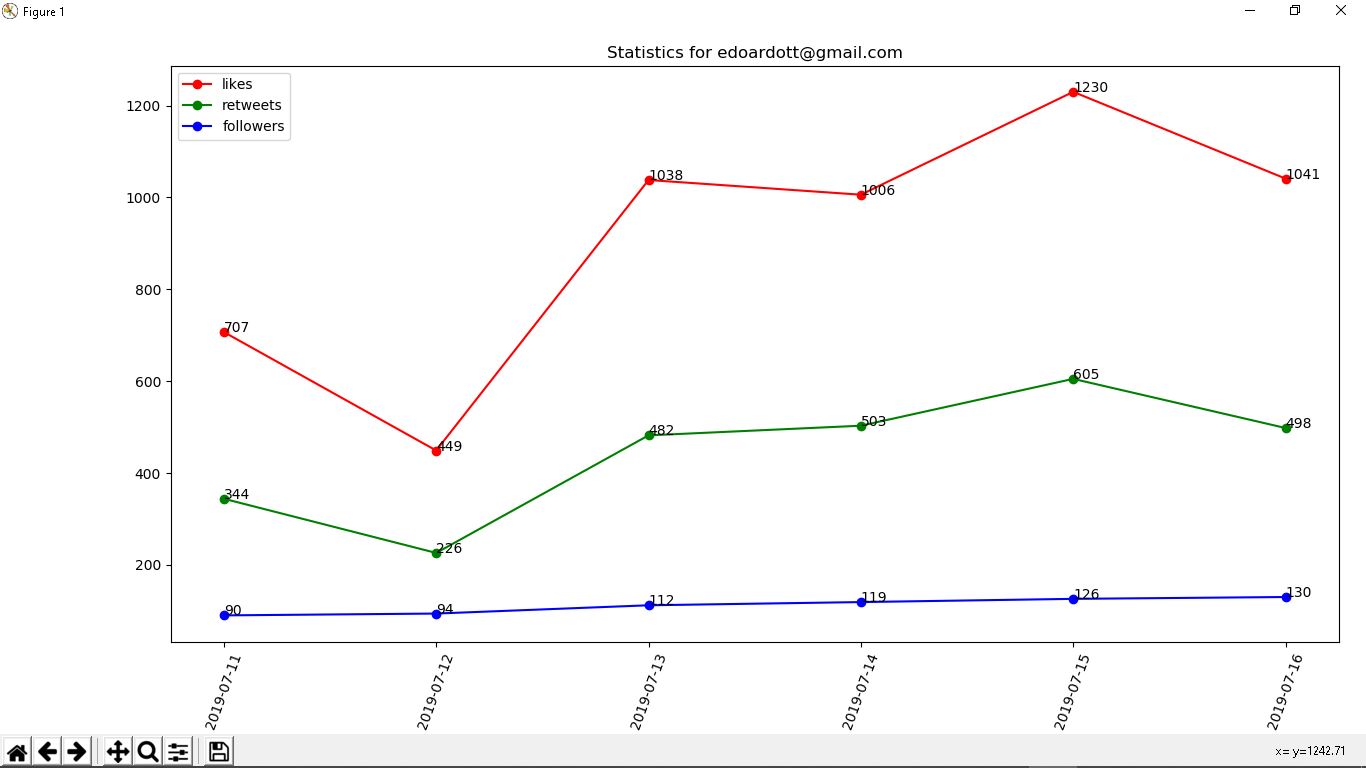
This is the data visualization per day.
If you want I read your comment very fast, this is my website