Beautiful, animated, and highly customizable toggle switches and sliders for Flutter.
Add to your pubspec.yaml:
dependencies:
  morph_switch: ^1.0.0
Then, run:
flutter pub getimport 'package:morphswitch/morphswitch.dart';
MorphSwitch(
stateValue: _isActive,
onBgColor: Colors.green,
offBgColor: Colors.red,
thumbOnIcon: Icons.check,
thumbOffIcon: Icons.close,
onSwitch: (value) => setState(() => _isActive = value),
),MorphSlider(
stateValue: _isDark,
onIcon: Icons.volume_up,
offIcon: Icons.volume_off,
onSwitch: (value) => setState(() => _isDark = value),
),| Property | Description | Example Values |
|---|---|---|
thumbType |
Thumb shape (circle, square) |
ThumbType.circle |
switcherRadius |
Border radius (per-corner) | SwitcherRadius.all(radius: 20) |
glassProperties |
Glass effect | GlassProperties(sigma: 2.0) |
onBgImage/offBgImage |
Background images | Paths.dayImg |
onLabel/offLabel |
Background Text labels | onLabel: "ON" |
isVertical |
Rotate the Switch 90° on x-axis | isVertical: true, |
imageTransitionStyle |
Image Transition Style (fade, scale, none) |
imageTransitionStyle: ImageTransitionStyle.fade, |
iconTransitionStyle |
Icon Transition Style (fade, scale, none) |
iconTransitionStyle: IconTransitionStyle.scale, |
switchCurve |
Animation curve for all the animated properties | switchCurve: Curves.bounceOut, |
size |
Preset size configuration | size: SwitcherSize.medium, |
textPadding |
Gives the onLabel/offlabel extra width |
textPadding: 20, |
-
Smooth Animations: Rotation, scaling, sliding, and dynamic transitions.
-
Fully Customizable: Colors, gradients, borders, icons, labels, and shadows.
-
Multiple Thumb Types: Circle (ThumbType.circle), square (ThumbType.square), or icon-based.
-
Glass Morphism: Frosted-glass effect (GlassProperties).
-
Image/Gradient Backgrounds: Use assets or gradients for the switch background.
-
Flexible Layouts: Vertical/horizontal orientation, responsive sizing.
-
Predefined Sizes: From SwitcherSize.small to xxLarge.
As a developer, you can modify everything in this package. The switching algorithm is intentionally designed to be simple and easy to adapt to your needs.
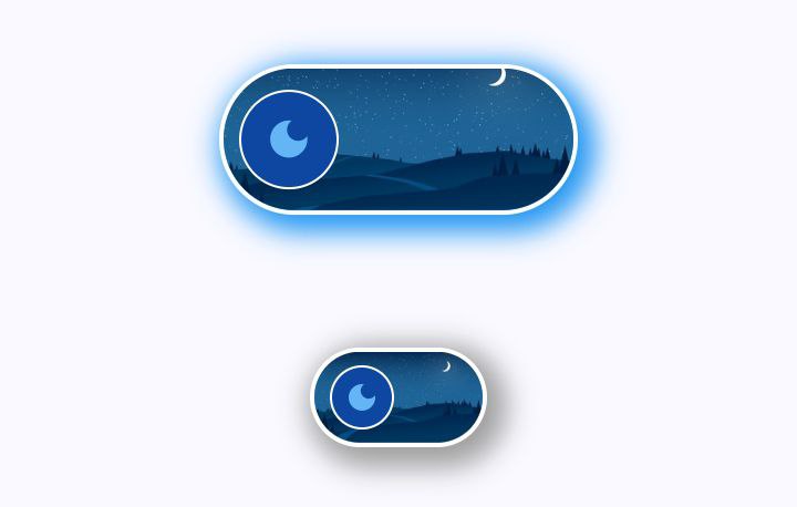
MorphSwitch(
  stateValue: testSwitcher11,
  onBgImage: Paths.dayImg,
  offBgImage: Paths.nightImg,
  switcherRadius: const SwitcherRadius.all(radius: 40.0),
  width: _screenWidth * .45,
  height: _screenHeight * .09,
  thumbRadius: 28.0,
  borderColor: Colors.white,
  thumbOnBgColor: const Color(0xFF77B254), //7B4019
  thumbOffBgColor: const Color(0xFF0D47A1),
  thumbOnIcon: Icons.light_mode,
  thumbOffIcon: Icons.dark_mode,
  thumbIconColor: testSwitcher11 ? Colors.yellow : const Color(0xFF64B5F6),
  thumbBorderColor: Colors.white,
  borderWidth: 2.0,
  boxShadow: <BoxShadow>[
    BoxShadow(
      blurRadius: 10.0,
      spreadRadius: 4.0,
      color: testSwitcher11 ? Colors.green.shade500 : Colors.blue.shade500,
      offset: const Offset(4, 4),
    ),
  ],
  onSwitch: (newValue) {
    setState(() => testSwitcher11 = newValue);
  },
),
Customizable background image and and outter shaow with switching curve
| MorphSwitch off State | MorphSwitch on State |
|---|---|
 |
 |
              MorphSwitch(
                stateValue: testSwitcher9,
                width: _screenWidth * .9,
                height: _screenHeight * .07,
                thumbRadius: 25.0,
                switcherRadius: const SwitcherRadius.all(radius: 40.0),
                onBgColor: Colors.green,
                offBgColor: Colors.red,
                thumbOnBgColor: const Color(0xFF3eff8b),
                thumbOffBgColor: Colors.grey,
                thumbOnIcon: Icons.mood,
                thumbOffIcon: Icons.mood_bad,
                thumbIconColor: Colors.indigo,
                onBgIcon: Icons.credit_card,
                offBgIcon: Icons.credit_card_off,
                onSwitch: (newState) {
                  setState(() => testSwitcher9 = newState);
                },
                onSwipeLeft: (off) {
                  setState(() => testSwitcher9 = off);
                },
                onSwipeRight: (on) {
                  setState(() => testSwitcher9 = on);
                },
              ),
              _gapH,

              MorphSwitch(
                stateValue: testSwitcher9,
                width: _screenWidth * .7,
                height: _screenHeight * .07,
                thumbRadius: 25.0,
                switcherRadius: const SwitcherRadius.all(radius: 40.0),
                onBgColor: Colors.green,
                offBgColor: Colors.red,
                thumbOnBgColor: const Color(0xFF3eff8b),
                thumbOffBgColor: Colors.grey,
                thumbOnIcon: Icons.mood,
                thumbOffIcon: Icons.mood_bad,
                thumbIconColor: Colors.indigo,
                onLabel: "HAPPY",
                offLabel: "SAD",
                onLabelStyle: const TextStyle(fontWeight: FontWeight.bold),
                offLabelStyle: const TextStyle(fontWeight: FontWeight.bold),
                /* onBgIcon: Icons.credit_card,
                offBgIcon: Icons.credit_card_off, */
                onSwitch: (newState) {
                  setState(() => testSwitcher9 = newState);
                },
              ),

              _gapH,

              MorphSwitch(
                stateValue: testSwitcher9,
                width: _screenWidth * .5,
                height: _screenHeight * .07,
                thumbRadius: 25.0,
                switcherRadius: const SwitcherRadius.all(radius: 40.0),
                onBgColor: Colors.green,
                offBgColor: Colors.red,
                thumbOnBgColor: const Color(0xFF3eff8b),
                thumbOffBgColor: Colors.grey,
                thumbOnIcon: Icons.mood,
                thumbOffIcon: Icons.mood_bad,
                thumbIconColor: Colors.indigo,
                onBgIcon: Icons.notifications_active,
                offBgIcon: Icons.notifications_off,
                onSwitch: (newState) {
                  setState(() => testSwitcher9 = newState);
                },
              ),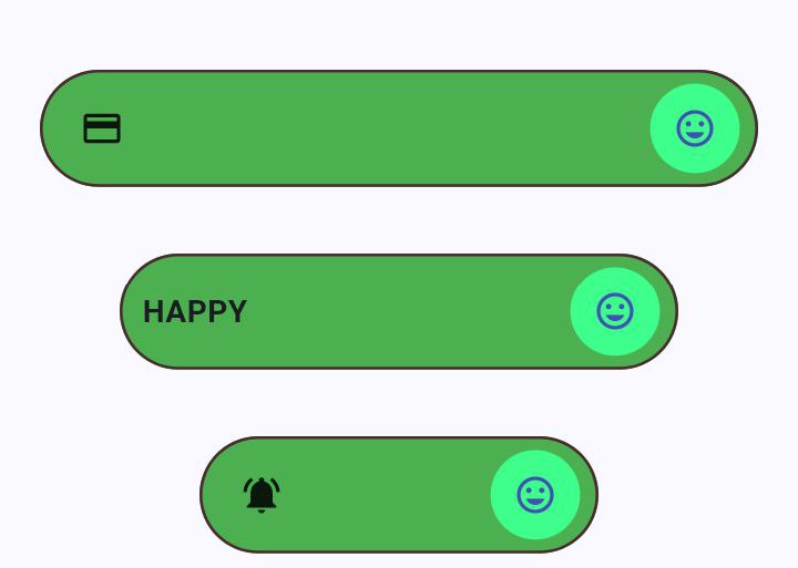
Customizable sizes for the
width,height, andthumbRadius
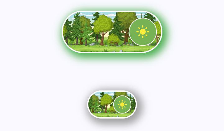
              SizedBox(
                height: _screenHeight * .2,
                width: _screenWidth * .8,
                child: Stack(
                  alignment: Alignment.center,
                  children: <Widget>[
                    Positioned.fill(
                      child: ClipRRect(
                        borderRadius: BorderRadius.circular(20.0),
                        child: Image.asset(
                          Paths.testGlass,
                          fit: BoxFit.cover,
                        ),
                      ),
                    ),
                    Positioned(
                      child: MorphSwitch(
                        stateValue: testSwitcher12,
                        width: _screenWidth * .45,
                        height: _screenHeight * .09,
                        thumbRadius: 23.0,
                        thumbOffBgColor: const Color(0xFFcb9292),
                        thumbOnBgColor: const Color(0xFF780C28),
                        switcherRadius: const SwitcherRadius.all(radius: 50.0),
                        glassProperties: const GlassProperties(
                          sigma: 1.0,
                          applyGlassLayer: true,
                          color: Colors.black12,
                        ),
                        borderColor: const Color(0xFFE4EFE7),
                        onSwitch: (newValue) {
                          setState(() => testSwitcher12 = newValue);
                        },
                      ),
                    ),
                  ],
                ),
              ),
              Row(
                mainAxisAlignment: MainAxisAlignment.spaceAround,
                children: <Widget>[
                  MorphSwitch(
                    stateValue: testSwitcher7,
                    size: SwitcherSize.large,
                    switcherRadius: const SwitcherRadius(
                      topLeft: 30.0,
                      bottomLeft: 30.0,
                      topRight: 15.0,
                      bottomRight: 15.0,
                    ),
                    applyThumbRotationAnimation: false,
                    switchCurve: Curves.easeOutQuart,
                    thumbType:
                        testSwitcher7 ? ThumbType.square : ThumbType.circle,
                    onLabel: "ON",
                    onLabelStyle: const TextStyle(
                      fontWeight: FontWeight.bold,
                      color: Colors.green,
                    ),
                    offLabel: "OFF",
                    offLabelStyle: const TextStyle(
                      fontWeight: FontWeight.bold,
                      color: Colors.red,
                    ),
                    thumbOnBgColor: Colors.green,
                    thumbOffBgColor: Colors.red,
                    onBgColor: const Color(0xFFb7cc92),
                    offBgColor: const Color(0xFFf19c79),
                    thumbOnIcon: Icons.volume_up_rounded,
                    thumbOffIcon: Icons.volume_down_rounded,
                    onSwitch: (newState) {
                      setState(() => testSwitcher7 = newState);
                    },
                  ),
                  _verticalDivider,
                  MorphSwitch(
                    stateValue: testSwitcher8,
                    size: SwitcherSize.large,
                    thumbOnBgColor: const Color(0xFF3eff8b),
                    thumbOffBgColor: const Color(0xFFb5838d),
                    thumbOnIcon: Icons.favorite,
                    thumbOffIcon: Icons.favorite_border,
                    onGradient: const LinearGradient(
                      colors: [
                        Color(0xFF3eff8b),
                        Color(0xFF31d843),
                        Color(0xFF38a700),
                        Color(0xFF386c0b),
                        Color(0xFFeaebf0),
                      ],
                      begin: Alignment.bottomLeft,
                      end: Alignment.topRight,
                    ),
                    durationInMs: 500,
                    offGradient: const LinearGradient(
                      colors: [
                        Color(0xFFb5838d),
                        Color(0xFFb5838d),
                        Color(0xFFe5989b),
                        Color(0xFFffb4a2),
                        Color(0xFFffcdb2),
                      ],
                      begin: Alignment.topRight,
                      end: Alignment.bottomLeft,
                    ),
                    thumbBorderWidth: 1.2,
                    thumbBorderColor: const Color(0xFF040303),
                    borderColor: const Color(0xFF040303),
                    switcherRadius: const SwitcherRadius(
                      topLeft: 30.0,
                      bottomLeft: 10.0,
                      topRight: 10.0,
                      bottomRight: 30.0,
                    ),
                    onSwitch: (newState) {
                      setState(() => testSwitcher8 = newState);
                    },
                  ),
                ],
              ),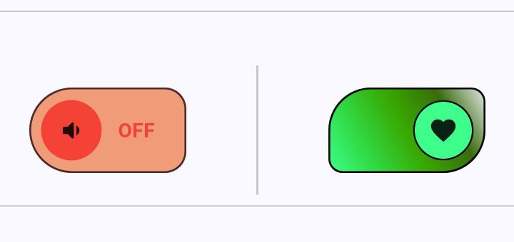
Customizable borderradius(
SwitcherRadius) and gradient backgroud
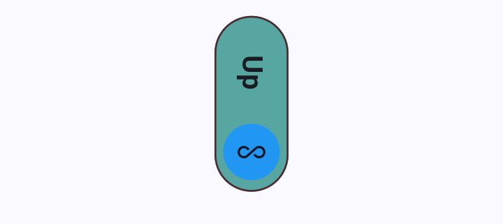
// Vertical Switcher

              MorphSwitch(
                stateValue: testSwitcher10,
                switcherRadius: const SwitcherRadius.all(radius: 30.0),
                margin: const EdgeInsets.symmetric(vertical: 30),

                /*  height: context.screenHeight * .05,
                width: context.screenWidth * .3,
                thumpRadius: 10, */
                switchCurve: Curves.easeInExpo,
                onBgColor: const Color(0xFF57A6A1),
                offBgColor: const Color(0xFFA0153E),
                thumbOnIcon: Icons.all_inclusive_sharp,
                thumbOffIcon: Icons.account_balance_sharp,
                durationInMs: 700,
                onLabel: "Up",
                offLabel: "Down",
                onLabelStyle:
                    const TextStyle(fontSize: 20, fontWeight: FontWeight.bold),
                offLabelStyle:
                    const TextStyle(fontSize: 20, fontWeight: FontWeight.bold),
                textPadding: 25,
                width: _screenWidth * .35,
                height: _screenHeight * .07,
                thumbRadius: 25.0,
                isVertical: true,
                onSwitch: (newState) {
                  setState(() => testSwitcher10 = newState);
                },
              ),

// Vertical Slider

              MorphSlider(
                stateValue: testSwitcher15,
                margin: const EdgeInsets.symmetric(vertical: 30),
                isVertical: true,
                switchCurve:
                    !testSwitcher15 ? Curves.easeInOut : Curves.bounceOut,
                size: SwitcherSize.xxLarge,
                sliderRadius: 25.0,
                onIcon: Icons.cloud_upload,
                offIcon: Icons.cloud_download_rounded,
                sliderBorderWidth: 2.0,
                thumbBorderColor: const Color(0xFF4C4B16),
                thumbBorderWidth: 2.0,
                sliderBorderColor: const Color(0xFF4C4B16),
                onSliderColor: const Color(0xFFE6C767),
                offSliderColor: const Color(0xFFFFEEAD),
                onThumbColor: const Color(0xFFA66E38),
                offThumbColor: const Color(0xFFF2EED7),
                onSwitch: (newValue) {
                  setState(() => testSwitcher15 = newValue);
                },
              ),
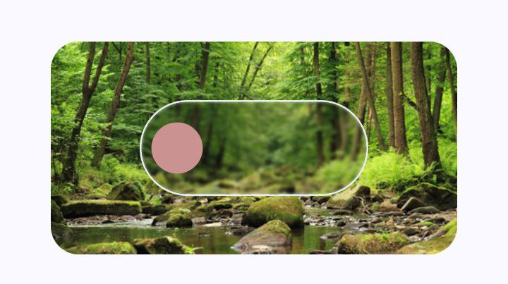
| Vertical MorphSwitch | Vertical MorphSlider |
|---|---|
 |
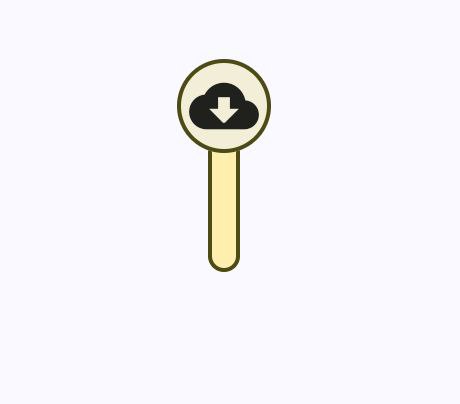 |
Rotate bothe Morphing Switch 90° on x-axis and match the icon rotation by -(pi / 2)
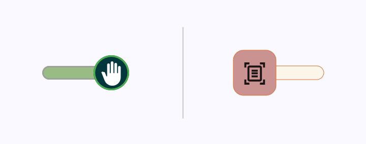
              Row(
                mainAxisAlignment: MainAxisAlignment.spaceAround,
                children: <Widget>[
                  MorphSlider(
                    stateValue: testSwitcher13,
                    offIcon: Icons.back_hand_outlined,
                    onIcon: Icons.back_hand_rounded,
                    thumbIconColor: Colors.white,
                    offSliderColor: const Color(0xFFEFEFEF),
                    onSliderColor: const Color(0xFF99BC85),
                    sliderBorderColor: Colors.grey,
                    sliderBorderWidth: 1.4,
                    size: SwitcherSize.large,
                    offThumbColor: const Color(0xFFA7D477),
                    thumbBorderColor: Colors.green,
                    sliderRadius: 20.0,
                    thumbBorderWidth: 1.6,
                    switchCurve: Curves.easeInBack,
                    durationInMs: 500,
                    onSwitch: (newValue) {
                      setState(() => testSwitcher13 = newValue);
                    },
                  ),
                  _verticalDivider,
                  MorphSlider(
                    stateValue: testSwitcher14,
                    size: SwitcherSize.large,
                    thumbType: ThumbType.square,
                    onIcon: Icons.document_scanner,
                    offIcon: Icons.document_scanner_outlined,
                    onThumbColor: const Color(0xFF780C28),
                    offThumbColor: const Color(0xFFcb9292),
                    offSliderColor: const Color(0xFFFBF6E9),
                    onSliderColor: const Color(0xFFF9C0AB),
                    sliderBorderColor: const Color(0xFFDF6D2D),
                    thumbIconColor: testSwitcher14 ? Colors.white : null,
                    thumbBorderColor: const Color(0xFFDF6D2D),
                    iconTransitionStyle: IconTransitionStyle.scale,
                    sliderRadius: 20.0,
                    applyThumbRotationAnimation: false,
                    onSwitch: (newValue) {
                      setState(() => testSwitcher14 = newValue);
                    },
                  ),
                ],
              ),
Contributions are welcome! Whether you're fixing bugs, adding features, or just improving docs, your help makes MorphSwitch better for everyone.
-
Report Bugs : Found an issue? Open a bug report. Please include:
- Steps to reproduce
- Expected vs. actual behavior
-
Suggest Features : Have an idea? Start a discussion:
-
Explain the problem it solves
-
Share use cases or mockups
-
MIT © Mahmoud Nagy