VizBlend is a Python package that simplifies creating interactive analytical reports and dashboards by consolidating Plotly figures into a single HTML file. It’s designed to function like a modern PowerPoint presentation but with the power of stunning and interactive data visualizations.
Whether you’re a data analyst, scientist, or developer, VizBlend streamlines the visualization workflow and enhances collaboration.
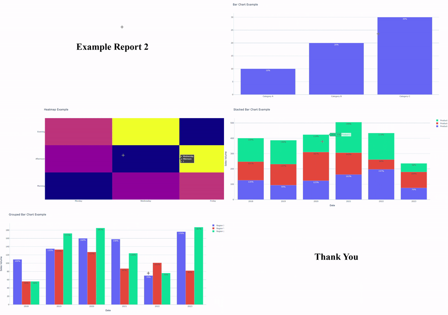
Below is a preview of a report generated with VizBlend:
⭐ If You Like It, Start it, please! ⭐
- Interactive HTML Report. Report Example
- Interactive HTML dashboard (PBI-like). Dashboard Example
- Static PPTX Report (PowerPoint-like). PowerPoint Example
Install vizblend using pip:
pip install vizBlend
Import vizblend and add figures
from vizblend.create_report import CreateReport
import plotly.graph_objects as go

report = CreateReport(report_title="Sales Report")
bar_fig = go.Figure(go.Bar(x=["A", "B", "C"], y=[10, 20, 30]))
report.add_figure(bar_fig, options={"title": "Sales Data"})
Generate the report
report_file = report.blend_graphs_to_html()
print(f"Report saved to {report_file}")
Beside its main job, this repo intends to teach aspiring data analysts or even data scientists who cannot have full control over their coding cycle. With a simple mission: create visualizations and append them to an HTML file, you can take your learning curve up to include useful skills:
-
Write unit and integration tests with edge cases to ensure your code is not error-prone.
-
Write CI/CD workflows to run on every push or pull request to ensure the newly committed code is compatible enough.
-
Creating, managing and deploying your package to PyPi so that you can simply run
pip install <package_name>and start using it.


