This project contains a dashboard analysing data of Formula 1 races from 1950 and up. A demo is available on Render here.
- Data Analysis
- Data Visualization
- Predictive Modeling
- Python
- SQL
- Plotly Dash
- Pandas
The goals of this project were to analyze some dataset with strong relational links using SQL and present the results as a clear and interactive dashboard, built in Plotly. The dashboard summarizes the top race winners and qualifiers for a given year selected by the user. Once a year is chosen, the dashboard can be used to summarize a driver's grid and result positions as well as the overall lineup for any circuit.
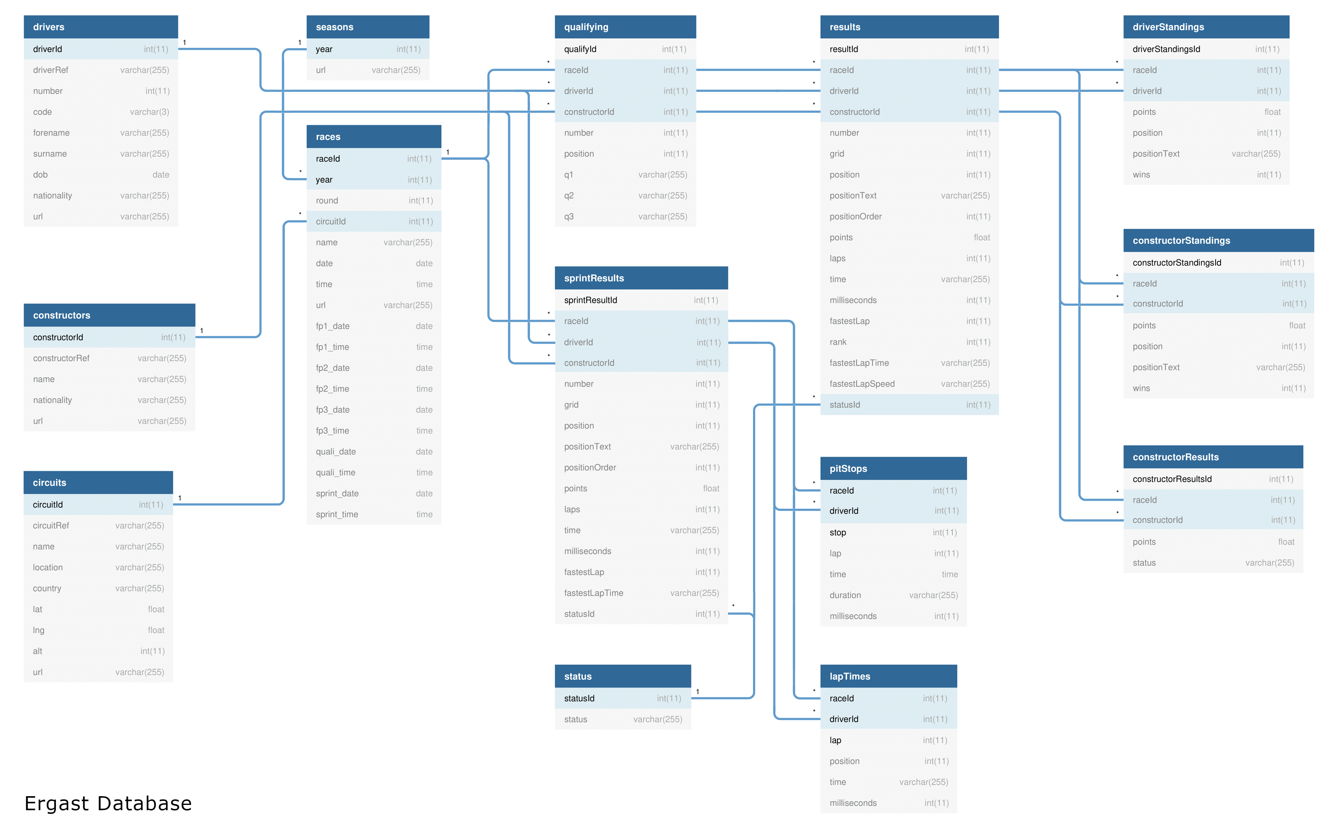
All this analysis makes use of a Kaggle dataset with the following schema (source):

A demo is available on the hosting service Render here (this uses the free tier and is thus significantly slowed down).
- Clone this repository.
- Raw data is being kept here within this repo in
.csvfiles. An sqlite database is located here. - A script to generate the sqlite database from the
.csvfiles can be found inscripts/.
To run dashboard, use
python3 app.py