Textplots is a tiny Java library that creates simple ascii-graphs for input datasets. Build to quickly print data distribution to logging output from code or inspect data from command line.
The library currently supports printing boxplots, histograms and scatterplots to command line. The following shows how this is done from code:
Boxplots
Boxplots display the distribution of a variable in a single plot by visualizing quartiles, minimum and maximum values.
The implementation allows to plot a set of boxplots in vertical direction to compare distributions for a range of variables. This can be done in code as follows:
List<Pair<String, double[]>> data = new ArrayList<>();
data.add(Pair.create("IRIS_SEPAL_LENGTH", IrisData.IRIS_SEPAL_LENGTH));
data.add(Pair.create("IRIS_SEPAL_WIDTH",  IrisData.IRIS_SEPAL_WIDTH));

Plot plot = new Boxplot.BoxplotBuilder(data).plotObject();
plot.printPlot();
Command line output:
IRIS_SEPAL_LENGTH|                   |------[#####|####]-----------||
IRIS_SEPAL_WIDTH ||-----[#|##]--------|                             |
                 |2,00                                          7,90|
Compare with ggplot2 plot: click
Histograms
Histograms display the distribution of a variable by dividing the entire range of its values into smaller intervals (bins) and then counting the number of values falling into each bin.
Plot plot = new Histogram.HistogramBuilder(
                Pair.create("IRIS_SEPAL_LENGTH", IrisData.IRIS_SEPAL_LENGTH))
                .setBinNumber(8)
                .plotObject();

plot.printPlot();
Command line output:
[4,30,4,75)|###                                               |n= 11
[4,75,5,20)|##########                                        |n= 30
[5,20,5,65)|########                                          |n= 24
[5,65,6,10)|##########                                        |n= 30
[6,10,6,55)|########                                          |n= 25
[6,55,7,00)|######                                            |n= 18
[7,00,7,45)|##                                                |n=  6
[7,45,7,90)|##                                                |n=  6
           |0%                                            100%|
Compare with ggplot2 plot: click
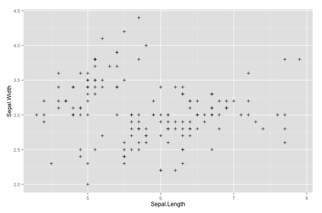
Scatterplots
Scatterplots display the distribution of values for two variables as a collection of points on x, y - coordinates.
Plot plot = new Scatterplot.ScatterplotBuilder(
                Pair.create("IRIS_SEPAL_LENGTH", IrisData.IRIS_SEPAL_LENGTH),
                Pair.create("IRIS_SEPAL_WIDTH", IrisData.IRIS_SEPAL_WIDTH))
                .setSize(50, 20)
                .plotObject();

plot.printPlot();
Command line output:
IRIS_SEPAL_WIDTH|4.40|                 · ··                             |
                |    |             ·  ·                                 |
                |    |            ·                                     |
                |    |                +   +                             |
                |    |            # ·#+   ·                           · |
                |    |     +    ·# ·     +                     +     + +|
                |    |         ·+ #·   ·                      ·         |
                |    |     + · #++#·  #       ·  ··                     |
                |    |  + ·+#  #+·#  +       #  ·+· #+  ++ ++  +        |
                |    |     # · # ·               #  #  ##  #            |
                |    | ++   ·+++·     +  #+  #·+     #·+#··  · +    · + |
                |    | ··   # ··     ·  ·#· ··#· ·· #+·+·   + · ·  · ·  |
                |    | ·                ·#+  ·+··#··##   ·     ·  +   · |
                |    |             ·   +·###  #··+ ++   +        ·   ·+ |
                |    |         +  #   ·+·##  +·  ++·    +               |
                |    |         +      ·+ ·       +                      |
                |    |   ·    · ·     +·          ·                     |
                |    |  +      +      +       +  #                      |
                |    |          +            #  ·                       |
                |2.00|         ·                                        |
                     |4.30                                          7.90|
                     |                                 IRIS_SEPAL_LENGTH|
Compare with ggplot2 plot: click
mvn:install will produce an executable jar in the target folder which can be called with the following arguments:
| Argument | Usage | Default | Required |
|---|---|---|---|
| -data | input data string, see below for an example | X | |
| -width | width of plot | 50 (chars) | |
| -height | height of plot (for scatterplots only) | 20 (chars) | |
| -min | lower visible boundary of (x) axis | minimum value in input data | |
| -max | upper visible boundary of (x) axis | maximum value in input data | |
| -minY | lower visible boundary of (y) axis | minimum value in input data | |
| -maxY | upper visible boundary of (y) axis | maximum value in input data | |
| -type | type of plot (boxplot, histogram or scatterplot) | boxplot |
Here is an example:
java -jar boxplots-1.0.jar -min 0 -max 20
-data '{series1|1,2,1,2,3,3,4,5,8,2,1}{series2|1,2,1,9,3,7,4,15,8,2,1}'
Each data series is enclosed with curly brackets and contains a name and the data points divided by a pipe ("|"). Data is split by a comma (","). Future versions will include parsing of csv files to allow for handling of larger data sets. Setting optional min and max parameters will visually restrict / expand the graph to given range.
The following R code uses ggplot2 to generate above diagrams and is provided as means for comparison with a sophisticated plotting tool:
library(ggplot2)
library(reshape2)
# boxplot
df <- data.frame(iris$Sepal.Width, iris$Sepal.Length)
md <- melt(df, variables=(c("iris.Sepal.Width", "iris.Sepal.Length")))
qplot(factor(0),value,data=md, geom='boxplot', color=variable) +
  xlab("") +
  coord_flip()
# histogram
ggplot(iris, aes(x=Sepal.Length)) +
  geom_histogram(colour="black", fill="white", breaks=seq(4.3,7.9,0.45),right=TRUE)
# scatterplot
ggplot(iris, aes(x=Sepal.Length, y=Sepal.Width)) +
geom_point(shape=3)This library will be completed as I see the need for use in other personal projects. Ideas include
- An improved CLI which reads CSV and other data formats
- Tukey boxplots (different treatment of Whiskers and plotting of outliers)
- Improve the legend by showing meaningful values between the min and max
- Allow customized formatting
- Add histograms
- Add colors
Feel free to contribute!