This project analyzes customer churn behavior for a telecom company using Power BI, Excel, Power Query, and DAX.
The goal of this project is to help the business understand:
- Why customers leave
- Who is more likely to churn
- Which customer segments are at risk
- What actions can reduce churn
This is a complete end-to-end data analytics project — from data cleaning to dashboard building to insight generation.


A telecom company is experiencing a high percentage of customer churn.
The management wants to understand:
- What drives customers to leave?
- Which locations and demographics have the highest churn?
- How do bill amount, satisfaction score, and tenure influence churn?
- What actions can reduce churn and improve retention?
This project aims to build an interactive Power BI dashboard to answer these questions clearly.
The client wanted answers to these:
- Which customer age groups churn the most?
- What are the top reasons for churn?
- Which locations have the highest churn?
- How does churn vary across age groups, payment methods, and service types?
- What is the average tenure and satisfaction score of churned customers?
- Do prepaid or postpaid users churn more?
- Which payment channels are linked to higher churn?
The dataset contains nearly 6,000 rows of data with the following columns:
- CustomerID — Unique customer identifier
- Churn_Status — Yes / No
- Age_Group — 18–25, 26–35, 36–50, 50+, Unknown
- Gender — Male, Female, Other
- Telecom_Circle — Customer location (state)
- Service_Type — Prepaid / Postpaid
- Payment_Method — UPI, Credit Card, Own App, Retail Store.
- Monthly_Charges — Monthly bill amount (numeric)
- Total_Charges — Lifetime bill amount (numeric)
- Tenure_in_Months — Months customer stayed (numeric)
- Customer_Satisfaction_Score — 1–5 rating
- Churn_Reason — Reason for leaving (if churned)
I cleaned the dataset using Excel and Power Query.
Below are the steps I followed:
- Removed leading & trailing spaces using
TRIM()/ Power Query Trim + Clean - Handled missing values:
- Payment_Method → filled with UPI (most common)
- Age_Group → Unknown
- Gender → Other
- Customer_Satisfaction_Score → filled with 3
- Churn_Reason → filled with other reasons if not mrntioned
- Telecom_Circle → ** if not mentioned Unknown**
- Dependents → No
- Fixed numeric issues:
- Removed
" Rs"text from numeric columns - Converted Monthly_Charges, Total_Charges, Tenure_in_Months to numeric
- Recalculated
Total_Charges = Monthly_Charges * Tenure_in_Months
- Removed
- Standardized categories for Service_Type, Payment_Method, Contract_Type
- Removed duplicates and invalid rows
- Loaded the final clean dataset into Power BI
Below are the key DAX measures used in the Power BI report:
Total Customers
Total Customers = COUNTROWS('Telecom Data')
Total Churned Customers
Total Churned Customers =
CALCULATE(
  COUNTROWS('Telecom Data'),
  'Telecom Data'[Churn_Status] = "Yes"
)
Churn Rate (%)
Churn Rate = DIVIDE([Total Churned Customers], [Total Customers], 0)
Avg Tenure of Churned Customers
Avg Tenure of Churned Customers =
CALCULATE(
  AVERAGE('Telecom Data'[Tenure_in_Months]),
  'Telecom Data'[Churn_Status] = "Yes"
)
Avg Monthly Charges of Churned Customers
Avg Monthly Charges of Churned Customers =
CALCULATE(
  AVERAGE('Telecom Data'[Monthly_Charges]),
  'Telecom Data'[Churn_Status] = "Yes"
)
Avg Satisfaction Score (Churned Only)
Avg Satisfaction Score of Churned Customers =
CALCULATE(
  AVERAGE('Telecom Data'[Customer_Satisfaction_Score]),
  'Telecom Data'[Churn_Status] = "Yes"
)
Answers:
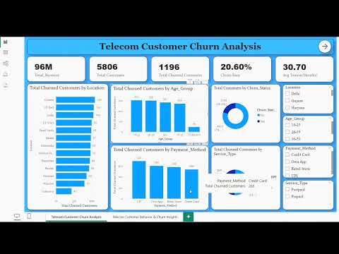
- What is the overall churn rate?
- Which locations have the most churn?
- Do certain age groups churn more?
- Which payment methods and service types show higher churn?
Visuals:
- KPI Cards: Total Customers, Total Churned, Churn Rate, Avg Monthly Charges, Avg Tenure
- Donut: Churn Status breakdown
- Bar: Churn by Telecom_Circle
- Column: Churn by Age_Group
- Bar: Churn by Payment_Method
- Pie: Churn by Service_Type
- Slicers: Telecom_Circle, Age_Group, Payment_Method, Service_Type
Explores reasons and behaviors driving churn.
Visuals:
- KPI Cards: Avg Tenure (Churned), Avg Satisfaction (Churned), Avg Monthly Charges (Churned)
- Column: Tenure groups vs Churn count
- Column: Customer_Satisfaction_Score vs Churn count
- Column/Bar: Monthly_Charges bins vs Churn count
- Bar: Churn_Reason (sorted by count)
- Slicers: Telecom_Circle, Age_Group, Payment_Method, Service_Type
- Churn Rate ≈ 20.6% — Opportunity to improve retention.
- Age groups 26–35 and 36–50 show higher churn — target with retention offers.
- Top churn reasons: Network Issues, High Price, Wrong Recharge Issues, Poor Customer Service, Competitor Offers.
- Certain circles (Gujarat, UP East, Delhi) show higher churn — investigate network quality and competitor activity.
- Prepaid users show different churn patterns than postpaid; target onboarding and first-month offers.
- UPI / Own App users churn more than cash/retail-store users.
- Churned customers have lower avg satisfaction (~2.8) and shorter tenure — focus on early engagement.
Thank you for checking out my project. Feel free to reach out if you want collaboration.