Buffs & Debuffs Redesign User Testing
After the Buff and Debuff icons are not that consistent in the game. We decided to do another round of user tests by putting the icons into the game. After it, We go through constructive comments on Buffs and Debuffs to redesign them.
A test plan was developed to determine whether the player is aware of the features and design elements. The feedback enables the team to determine whether the design is consistent with the user’s previous experience in similar games and whether changes to the visual design or interactive elements are required.
The user test will adopt a questionnaire to collect data once users have experience with the game, which will give players a more intuitive connection to our test and it makes up for the shortcomings of the last user test.
What preparations have been made:
- Users will play the game to try getting familiar with it.
- Users will complete the tasks mentioned by the questionnaire.
- Questions to ask users after the experiment.
- Invite 5 test users to do it.
The questionnaire was implemented by the google form and the detail of content was list below.
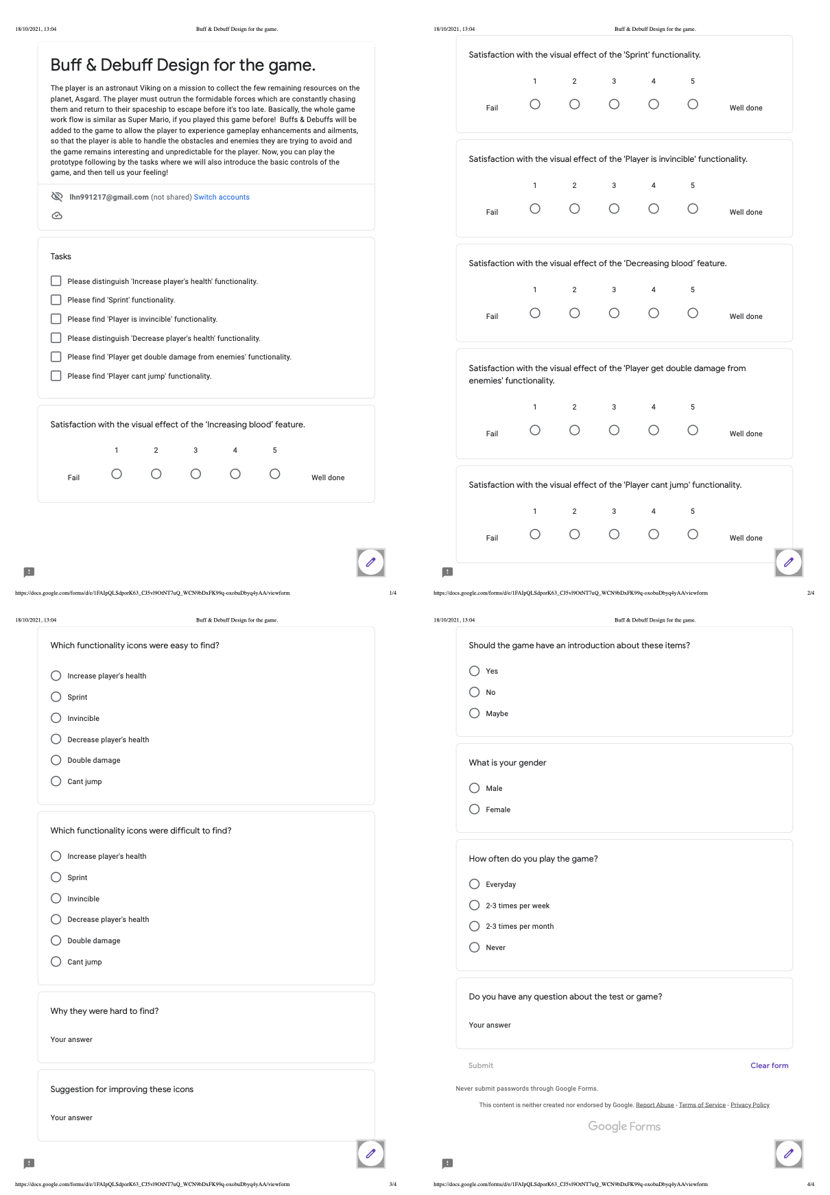
- Design products without this round user test:
- Increase health by 20:
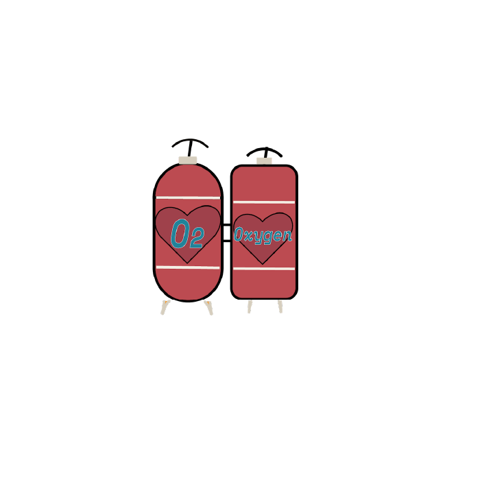
- Sprint Buff:
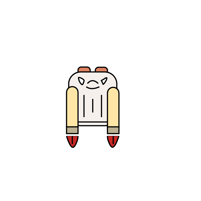
- Invincibility:

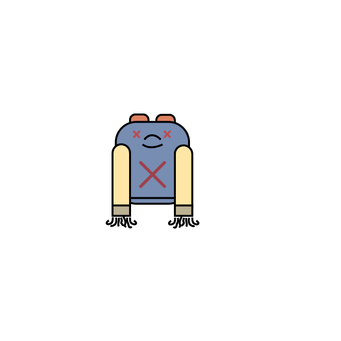
- Decrease health by 20:

- Double damage:

- Cant Jump Buff:
We have summarised the feedback of users below:
In general, users thought that this icon made sense. However, the biggest problem is that it was a little bit tiny in the game and users actually can not recognize the word of the icon. Therefore, the "Oxygen" was replaced by the "O2" and "+20" to make it interactive and the frames have also been bolded to keep them striking.
There were 3 out of 5 users can not recognize the icon as a Sprint functionality. The constructive suggestions were changing the jet pack to shoes, using fire or flash replaced by the lines, and using more aggressive color themes respectively. Therefore I decided to redesign the whole icon. The main part has consisted of shoes and flash. After it, the users were satisfied with it.
Two users indicated that textual hints could be added to the buff to tell the player the function of the buff. Using bright colors in the colors would allow players to see it more immediately. Gold is a good choice, it makes the buff look like it is glowing.
Similarly, with the Decrease20 buff, it is only necessary to add a text description so that the player can recognize the function of the buff at a glance. The CO2 icon could also be enlarged to make it easier for the player to see.
Similar to the Invincible buff, users felt that changing a purple color would make it feel more like an effect such as injury or poisoning, and a text description could be added to make the function of the buff clearer to the player.
As the Cant' Jump debuff has to be designed similar to Sprint buff, its test results were also disastrous. Users failed to recognize it as Cant Jump debuff. Suggestions for its changes included giving an X-shaped element, a broken shoe, or the character breaking his leg. In order to make the icons easier to understand within the game, I decided to go with the idea of the spring shoe being locked, and most of the users agreed with this.
- Increase health by 20 buff:

- Sprint Buff:

- Invincibility:

Based on user feedback and suggestions, the five senses of the original buff were removed and a tableau of text and arrows was added to show that the buff was about enabling the player to skill max.
- Decrease health by 20:

The text -20 has been added to the appearance of the original buff and the CO2 icon has been enlarged to make it more recognizable to players.
- Double damage:

Based on user feedback and suggestions, the original buff's five senses have been removed and a tableau of defense text and arrows has been added. The color has been changed to purple to give the buff a more negative appearance.
- Cant Jump Buff:
